About the Project
TickerRisk is a web application designed for options traders, providing tools to evaluate trading risk, monitor positions, and make more informed financial decisions.
Although I’m familiar with investing, I quickly realized this wasn’t a product I could accurately validate from a business perspective. Rather than pretending to understand complex trading algorithms, I adjusted my approach.
Instead of validating financial calculations, I focused on something every product shares: The user experience.
Understanding Before Testing
One principle guides every review I perform. Before testing functionality, I first try to understand what the product is trying to accomplish.
In this case, that meant accepting something important: I wasn’t the target user.
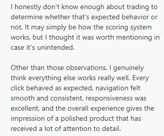
Instead of forcing test cases that wouldn’t provide meaningful feedback, I shifted my attention toward navigation, responsiveness, authentication, usability, consistency, and the overall experience surrounding the platform. Sometimes, understanding what not to test is just as valuable as knowing what to test.

What Went Well
One thing became clear almost immediately. The product already felt polished.
Several aspects stood out positively. Clean, modern interface. Excellent responsiveness across different screen sizes. Consistent navigation. Well-designed pricing flow. Straightforward authentication. Clear onboarding. Helpful educational resources through the Learn section. Strong transparency through legal disclaimers and company philosophy.
One detail I especially appreciated was the About page. Reading that the platform is built by traders for traders immediately adds credibility and helps establish trust with users.

Opportunities Identified
Rather than identifying major functional issues, the review primarily uncovered opportunities to further refine the overall experience.
The observations centered around:
User interface consistency. Navigation behavior. Authentication experience. General usability improvements. Product polish.
Overall, the platform demonstrated a high level of maturity, with most recommendations focusing on refinement rather than correction.
Something I Appreciated
One thing I always enjoy finding isn’t a bug. It’s evidence that a team genuinely cares about their product.
Throughout the review I kept encountering small decisions that reflected thoughtful product design. Consistent pricing behavior. Helpful educational content. Transparent communication. Simple account management. These details rarely receive attention, yet they’re often what makes software feel professional.
Outcome
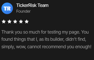
The founder thanked me for taking the time to review the platform and shared that they planned to implement the observations mentioned throughout the review. They also later gave me permission to publicly showcase both this review and their feedback as part of my professional portfolio.
Client Feedback
“Hey Jerry, thank you so much for your time… I can see you put a lot of it into my half-baked project… I cannot thank you enough!”
Lessons Learned
This review reinforced something I’ve come to appreciate more and more.
Quality Assurance isn’t always about finding major defects. Sometimes the product already works remarkably well.
In those situations, QA becomes something different. It becomes about identifying the small moments that make good software become exceptional software.
Final Reflection
One decision from this project continues to shape how I approach Quality Assurance today.
Rather than trying to appear knowledgeable about a domain I didn’t fully understand, I chose to be honest.
I focused on what I could confidently evaluate. The user experience. The navigation. The authentication flow. The consistency.
Because meaningful QA isn’t about pretending to know everything. It’s about understanding where your expertise provides the greatest value